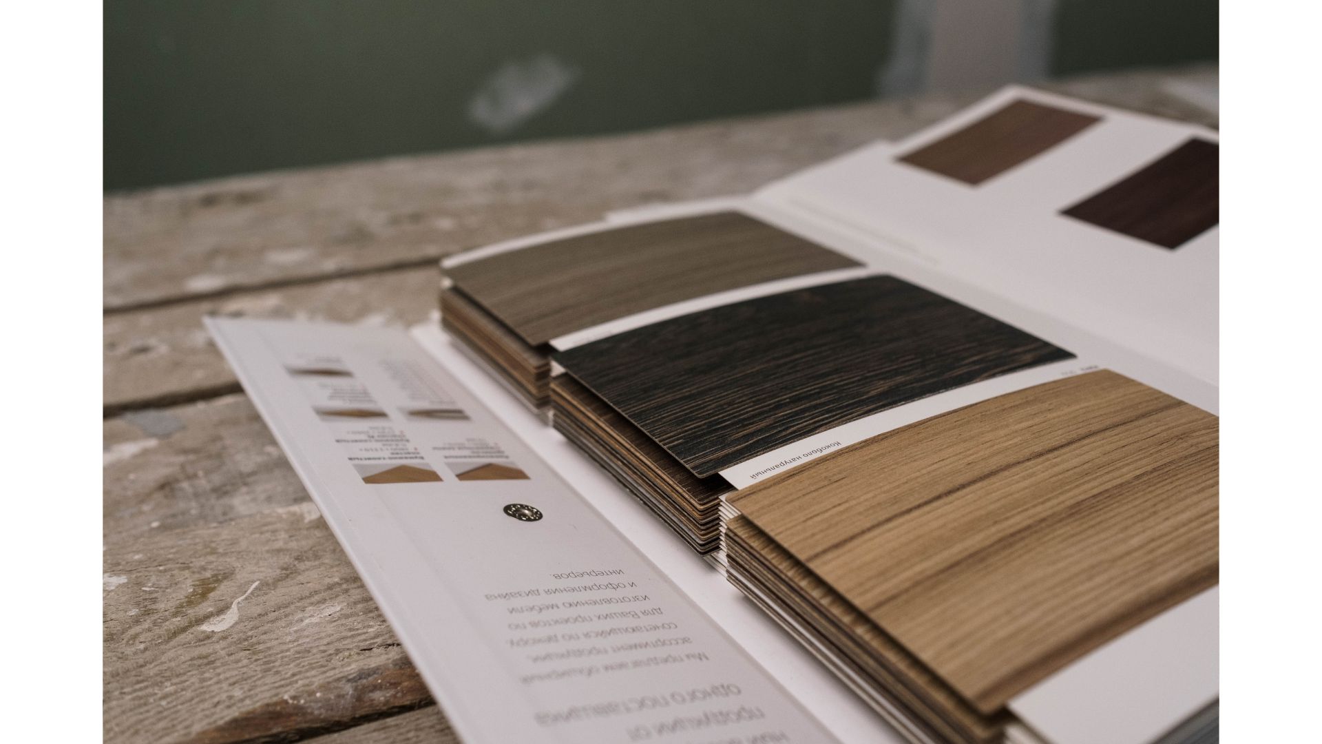
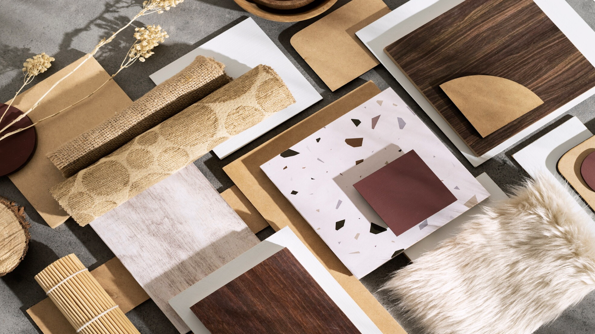
You’re at a dealer showroom on a Saturday afternoon. The wall is packed—120 shades of “white,” 40 woodgrains, 18 marbles, 9 textures that all promise “luxury.” A young architect beside you whispers, “It’s amazing… but I don’t know what to pick.”
And that’s the moment your product range stops being a catalogue—and starts behaving like noise.
Most young designers, architects, brands, and traders don’t struggle because they lack options. They struggle because they lack a clear cast.
In cinema, you don’t introduce 50 characters in the first five minutes. You start with the hero, establish their purpose, then bring in the supporting cast, each one adding meaning, tension, or depth. Product curation works the same way: the goal is not “more SKUs.” The goal is a range that sells because it tells a story.
Why “Too Many Choices” Quietly Kills Conversions
There’s a famous real-world study on choice overload: a tasting booth with 24 jam options attracted more people, but only 3% bought; the booth with 6 options attracted fewer people, but ~30% bought.
Designers may not be buying jam, but we are choosing finishes under pressure: client meetings, budgets, timelines, “send 3 options by tonight.” When you place an endless wall in front of a decision-maker, you don’t create luxury. You create hesitation.
And hesitation is the enemy of both design confidence and sell-through.
The Product Range as Theatre: Build the Cast, Not the Crowd
At Bureau Forma, we often simplify curation using a theatre lens:
1) Hero SKUs (the lead role)
These are your signature choices, your “this is who we are” products. They should be few, memorable, and instantly defensible in front of a client. A hero SKU is not just a bestseller; it’s a brand statement with commercial reliability.
2) Supporting Cast (the enablers)
These SKUs exist to make the hero easier to specify and easier to sell: matching edge bands, companion solids, workable textures, price-accessible alternates, dependable repeats. They protect the hero by expanding its usability across projects.
3) Niche Characters (the specials)
Trend-led finishes, experimental textures, high-maintenance beauty, kept intentionally limited. They create buzz, but they shouldn’t confuse the customer journey or overload the display.
When every SKU fights for attention, none of them becomes the obvious choice. But when each SKU has a role, the range becomes a system—and systems scale.
Tiering: The Shortcut to Story + Strategy
Here’s a practical tiering framework young professionals can apply, whether you’re curating a brand range, a trader’s assortment, or even your own client-facing material library:
Tier A: The Edit (6–12 Hero SKUs)
Your fastest “yes.” These should cover the most common project styles and represent your signature aesthetic.
Tier B: The Toolbox (20–40 Supporting SKUs)
Workhorse options that solve real-world constraints: lighting conditions, maintenance, budget bands, availability, coordination.
Tier C: The Gallery (seasonal / limited / experimental)
Rotating inspiration. Keep it curated, named well, and merchandised like a feature, never like clutter.
This isn’t about reducing creativity. It’s about directing it.
Turn SKUs into a Narrative People Can Repeat
A product becomes easier to sell when the story is easy to remember.
Instead of: “Here are 300 options.”
Try: “This is our hero story: Calm Modern. These are the three supporting moods: Warm Grain, Soft Stone, Clean Solid.”
Give your SKUs a narrative architecture:
-
A clear “Why” (what design problem it solves)
-
A clear “Where” (which project type it suits)
-
A clear “With what” (its supporting pairings)
The magic is not in adding poetic adjectives. The magic is in building repeatable clarity, so your dealer team, your architect community, and your own internal sales team can say the same thing without improvising.
Quote
“As an architect it is about… being immersive and attentive to the environment, the materials, and its inhabitants…” — Bijoy Jain (Studio Mumbai), Foundation Cartier
That attentiveness applies to product curation too: when you respect context, you stop dumping options—and start guiding decisions.
Takeaways
-
Curate like a storyteller: define Hero SKUs first, then build a supporting cast that makes them easier to specify.
-
Use tiering to create clarity: keep an “Edit,” a “Toolbox,” and a rotating “Gallery”—each with a job to do.
-
Design the decision path: fewer, better-presented options convert faster than endless walls of similar finishes.
-
Name and pair intentionally: every SKU should be easy to explain, easy to combine, and easy to sell.
This Blog is written by Priyanka Dwivedi, who is a seasoned texture designer with 20+ years in India’s interiors and modular-kitchen industry, with deep hands-on expertise across materials and surface systems.