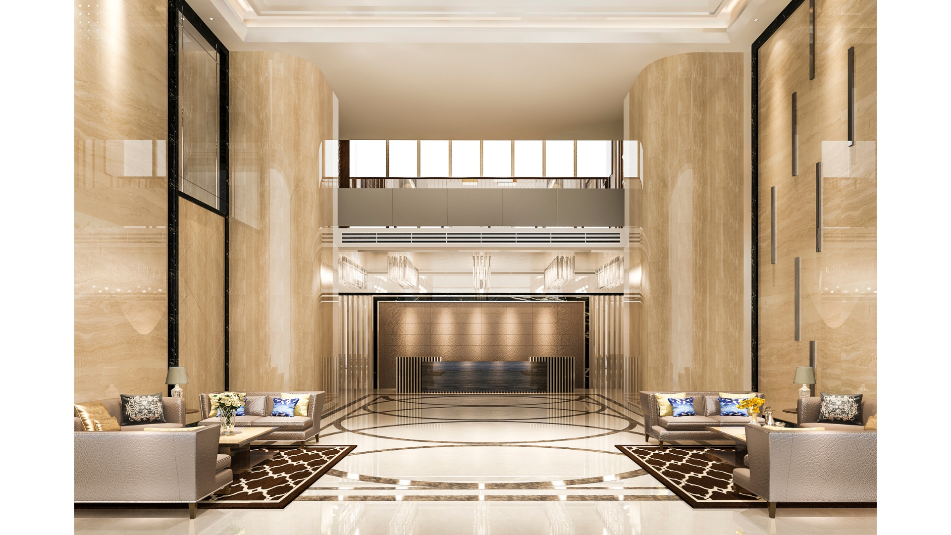
What Defines a Premium Finish Today?
This editorial from Bureau Forma is for the doers—the young designers, brand teams, and traders shaping India’s interiors market. We’re unpacking a simple truth: “premium” is not a price tag; it’s a choreography of perception, tactility, and story that turns everyday materials into objects of desire.
Why “premium” is a design problem, not a cost problem
India’s decorative laminates market touched ~USD 1.89B in 2024 and is projected to approach USD 2.95B by 2033. Modular kitchens, a bellwether for finish expectations, were ~USD 3.51B in 2024 with steady growth ahead. The opportunity is real, but so is the noise. Winning brands aren’t merely “better”—they’re clearer about what better feels like, looks like, and says about the buyer.
Premiumization in India keeps rising with income growth and urban aspirations, but value is fragile; buyers reward meaning, not just markups. That’s why finish strategy—the choreography of surface, edge, sheen, and narrative—is now a brand’s most reliable lever for margin and memorability.
Perception: the first five seconds
Premium begins before touch. It’s in the way light rakes across a panel, the fidelity of color under daylight vs. warm LEDs, the restraint of a logo on a sample chip, and the confidence of your naming system (not “grey #47,” but “Basalt Calm—EB-cured, low-gloss, anti-smudge”). Consistency across swatch → sample box → showroom → site photos builds trust; any mismatch breaks the spell.
Checklist for perception:
- Lighting logic: Shoot and show finishes at 3000K and 5000K so specifiers can predict color drift.
- Naming/labels: Tie each finish to a clear benefit (“UV stable,” “anti-fingerprint,” “repairable micro-scratches”)—not just poetry.
- Visual hierarchy: Keep the eye on the surface—subtle brand marks, disciplined grids, no clutter.
Tactility: when the hand confirms the heart
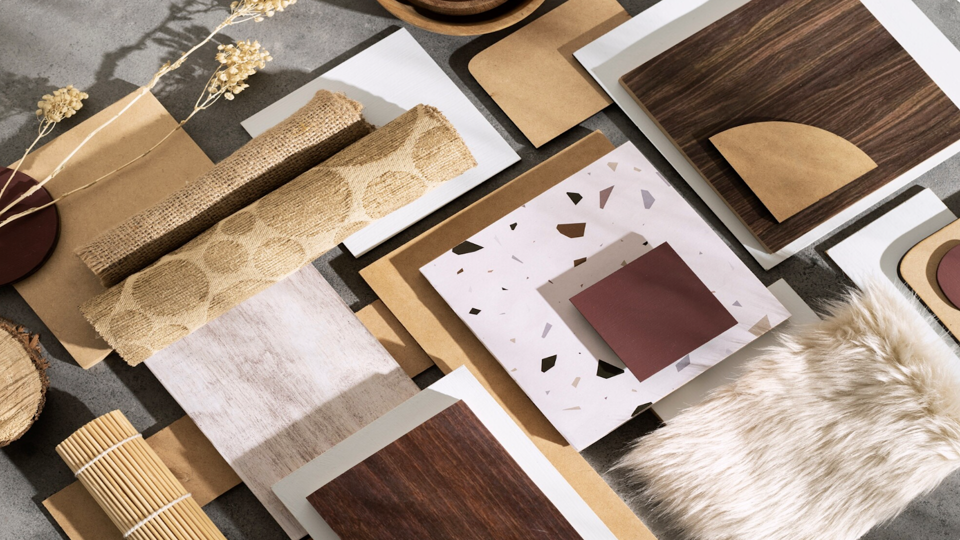
The hand is your truth detector. Micro-emboss patterns that sync with print, soft-matte topcoats that resist smears, radius edges that don’t betray the substrate—these are the touches that make a surface feel expensive. Thickness perception matters too; even when substrates are equal, edge design (color-matched ABS, tight glue lines, soft radius) can move a product from “commodity” to “considered.”
“The essential material is breath.” — Bijoy Jain (Studio Mumbai), interview with TLmag (2023).
Jain’s line is poetic, but the takeaway is practical: materials feel “alive” when temperature, texture, and weight speak a coherent language. If your “luxury” matt feels sticky in humidity or warms too fast under task lighting, it breaks the illusion.
Checklist for tactility:
- Micro-tests: Run blindfold rub tests with designers—ask them to rank “softness,” “dryness,” and “noise” when fingers glide.
- Edges as evidence: Standardize 1–2 premium edge profiles and a color-match SOP; teach your sales team to demo the edge first.
- Prototypes in use: Scatter samples in real kitchens/wardrobes and record wear every 30 days—nothing beats lived-in proof.
Story: the meaning inside the material
Luxury is attention you can feel. Tell a finish’s story in three beats:
- Origin (tech, craft, or collaboration),
- Performance (measurable claims),
- Use-case (a clear mental picture: “fingerprint-proof breakfast islands,” “low-glare hospitality lobbies,” “kid-friendly wardrobes”).
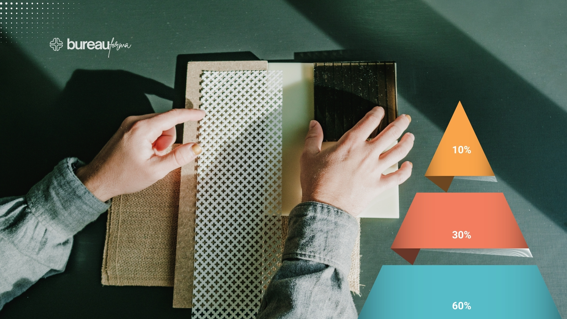
Map these stories to your Product Pyramid (Access/Core/Signature). Keep Access honest (clean basics), Core distinctive (signature textures and service SLAs), and Signature rare (limited drops, collabs, numbered runs). When story and tier align, sales scripts write themselves.
Designing a premium ladder (fast)
- One hero, three experiences: Take a hero décor and express it as soft-matt Access, tactile Core (sync-emboss, UV resistance), and halo Signature (artisan collaboration or advanced finish chemistry).
- Price for ladders, not cliffs: Keep tier steps around 12–18% on comparable SKUs; make upgrades feel near, not shocking.
- Evidence beats adjectives: Replace “ultra” and “super” with data—gloss units, abrasion cycles, ΔE color stability. Show the metric, then show the room.
Go-to-market: stage it like a product launch
Borrow from fashion calendars. Quarterly drops with clear themes, sample refreshes, and designer previews keep attention compounding. For kitchens and wardrobes, align releases with real estate handovers and festive renovation cycles. Keep the theater tight: a one-page spec card, a 45-second video under mixed lighting, and installed photography within 30 days of launch.
The bigger arc: India’s taste is maturing
As new Indian consumers trade up, they’re seeking quiet, tactile sophistication rather than loud gloss alone. The brands that win will be those that curate restraint, prove durability, and speak in stories that respect craft and context—not those that merely add SKUs.
Takeaways
- Design the feel, then the finish. Lock lighting, texture, and edge rules before naming and pricing.
- Make proof portable. Use simple metrics (GU, ΔE, abrasion) and live-in prototypes to replace adjectives.
- Build a ladder. Express one décor across Access/Core/Signature with 12–18% price steps and visible tactile gains.
- Launch in rhythm. Plan quarterly drops with real use-cases, installed photos, and tight sample kits.
Call-to-Action Question
Want to test your finish’s feel with peers across India—and co-create a shared playbook for premium surfaces? What would you bring into the next Forma Loop session?
This Blog is written by Priyanka Dwivedi, who is a seasoned texture designer with 20+ years in India’s interiors and modular-kitchen industry, with deep hands-on expertise across materials and surface systems.